
Does your website design make your site look instantly professional and reputable? Or does it give the wrong impression? Maybe it’s very dated, and looks rather amateur … or worse, broken. Maybe it doesn’t do a good job of reflecting your brand. Whether you’re considering a total revamp, or just a few tweaks, here are ten crucial ways your design can act to build (or erode) visitors’ trust.
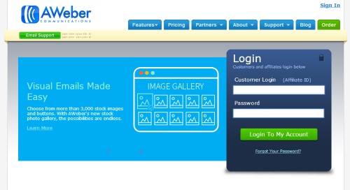
If there’s only one thing you consider, make it your navigation, which also adds to an effective internal linking strategy. If visitors can’t easily find what they’re looking for, they’ll often leave in frustration. This means you need to avoid complicated nested menus, and navigation based on images rather than words. Clear, straightforward navigation also shows you have nothing to hide. For instance, you’re not tucking your contact details away in the footer, hoping to cut back on customer service resources.
We like Aweber’s clear navigation, with an obvious Login box, and a clear menu with drop-downs indicated by arrows:
Does your homepage instantly look right? Many visitors will arrive there first, and it needs to create the right first impression. If something seems “off” about it, you’ve already subtly eroded their trust in your company. One simple way to get your layout right is to use the “rule of thirds”. This guideline, often associated with photography, means that you position important elements along an invisible “grid” of lines.
You can see some great examples of the “rule of thirds” applied to web design in Carrie Cousins’ post Understanding the Rule of Thirds in Web Design:

One easy way to go wrong with web design is to use too many different colours and fonts in an attempt to make things interesting. If you think of any well-known brand, though, you probably associate it with a particular colour and typeface — think of the particular shade of “Cadbury purple” for instance, and the swirly, joined-up letters in the word “Cadbury”. You can use a colour wheel to create a colour palette of co-ordinating colours for your website: Adobe Kuler has a free one here. In terms of fonts, you’ll want one for headlines and one for body text, and you’ll also want fonts that convey your corporate brand. (Traditional? Modern? Quirky?)
Pamela Wilson’s Big Brand System uses specific shades of red and blue, plus greyscale, for a clean, co-ordinated look:

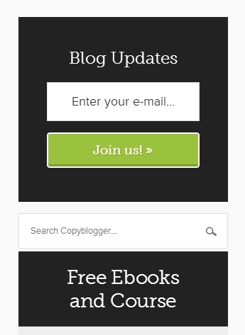
If you have a blog-style website, with a right-hand sidebar, be careful not to let it get cluttered. It’s easy to add more and more widgets over time — until you end up with a sidebar full of clashing blocks that offer visitors a bewildering array of choices. It’s worth reviewing your sidebar on a regular basis to ask yourself whether you can do without any of the widgets. Are they really being used by your visitors? If your web designer included some by default, do you really need them?
Copyblogger has a clean, clutter-free sidebar that focuses visitors’ attention on the actions that the site owners most want them to take (subscribing to the blog, registering for the free content):
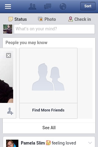
Different browsers render websites in slightly different ways. Perhaps your site is designed for Internet Explorer users — but a lot of your visitors are on Firefox or Chrome. It needs to both look good and (crucially) function correctly in those browsers, and on mobile devices too. If elements are misplaced, or running into one another, your site will look shoddy, and it certainly won’t inspire trust. A great free tool for checking how your site looks in (a huge number of) browsers is Browser Shots. You just put in your site URL, and you’ll get a list of screenshots as they’re produced. For a quicker, more thorough tool, try BrowserStack — this costs from $39/month.
Many sites have a separate, mobile-optimised version for visitors using a phone or tablet. Here’s Facebook’s:
Design isn’t just about what you see — it’s about what you don’t see. The spaces on your website are crucial to making it look great, and to helping visitors relax and take in your content — a crucial step to building trust. Consider adding extra spacing:
Graze (Joe and I are both fans!) have an attractive, inviting home page that explains how their boxes work. It uses plenty of white space to show off the quirky, friendly design to great effect:

If you’ve worked with some big-name clients, put their logos on your website to help showcase your expertise and connections. You can see some that we’ve worked with towards the bottom of the right-hand sidebar on our home page. You can use these almost anywhere in your design: on your About page, alongside testimonials, or even on your homepage. The trust that a potential customer already has for these organisations will help them to trust you too.
Firepole Marketing have the logos of sites they’ve appeared on (usually by writing guest content) on their homepage:

It’s tempting to want to do something “different” and unique with your design — but web users like things to be simple and straightforward, following the conventions that they already know. That way, they can easily and quickly navigate your site to find the information they need. Try to keep common design conventions in mind. For instance:
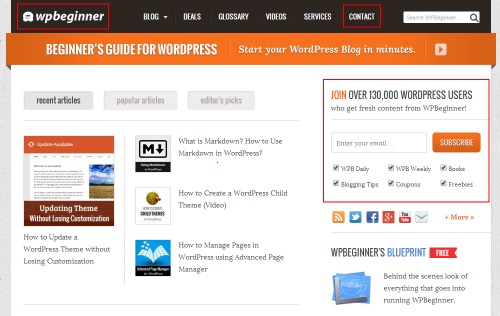
WPBeginner have a Home link (their logo) on the far left, a Contact link on the far right, and their email sign up form at the top of the sidebar, as indicated in the screenshot below:
Like it or not, your visitors will make snap judgements about your website based solely on its design. If you have a clear, professional, easy-to-navigate site, they’ll instantly have a good impression of you. If your site looks cluttered, if the colours and fonts jar, and if they can’t find what they’re looking for … they almost certainly won’t come back. What changes could you make to your site design, during the next week or month, to help visitors trust you instantly?
 Of course, design isn’t everything: you also need great content on your site. If you’d like some help with that, book a place on our Content Marketing course: you’ll get hands-on experience in a small group, with plenty of opportunities to ask questions.


Designed, Built and Optimised by Joe the SEO
© Tribe SEO is a registered UK Company (# 07455058). Privacy Policy and Terms.
This site is protected by reCAPTCHA and the Google Privacy Policy and Terms of Service apply.
